
Can we help? 01942 521919
Contact us The relationship between colour, shape, and consumer behaviour is not a new concept. Marketers have been researching colour psychology and how colour can impact buying decisions for a long time.
Colour is a hugely powerful communication tool and can be used to influence a certain action, influence moods, and even influence physiological reactions.
Certain colors have even been associated with increased blood pressure and causing eye strain.
When it comes to marketing and consumer behaviour, colour can affect consumers in many different ways. Certain colours can provoke impulse purchases, whilst others can influence a negative reaction and lead to losing sales.
Therefore, if you decided on the colour of your packaging due to the fact you liked the colour, somebody in your team suggested it or if it’s a family member’s favourite colour. You may be missing out on how that decision has actually impacted the number of sales and continues to impact your customers.
The colours you choose for your packaging should project the intended subliminal message to attract your target market and prompt them to make the decisions you want them to make.
Packaging design creative strategist, Jenn David Conolly states
“ Colour influences consumers not only on the conscious level but also on the subconscious level”
This means that choosing the colour for your packaging can be equally as important as choosing ingredients for a food product.
For example, bright colours tend to reduce the seriousness of packaging, black adds a sense of luxury, whilst red draws attention. Several successful brands have managed to master the element of colour psychology within their branding strategy, which as a result makes their packaging unmistakeable.
Successfully owning a colour is a big deal and this can provide an enormous competitive advantage in terms of brand awareness and standing out
Here are a few examples of successful businesses known for their iconic colour.
It is important to think like your customers, put yourself in their shoes and think how would they feel when they came across your packaging design. Think about their age, gender, level of education, even things like what motivates them to buy.
All of this key information should be taken into consideration before making your colour choice.
It is important to make sure that the colours of your packaging send the right message. If your colours are extremely bright and loud, but in fact your marketing message is based around simplicity and minimalism this doesn't match up.
It is important to know what your brand message stands for. Does it stand for luxury? Value? Wellness? And have you chosen a colour which also stands for those values.
Here are some examples of the most commonly used colours on packaging and the messages they portray…
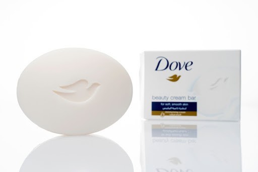
The colour white can feel fresh and clean. The color is often used to evoke a sense of youth and cleanliness.
As a packaging colour, white is safe and simple, some may see it as unadventurous but a good choice where you want to create packaging that signifies purity, efficiency, or simplicity.
A famous example of a brand that owns the colour white is Dove.
When used in packaging black stands out and gives the product a sense of high-end luxury. It can also be a great colour to provoke mystery and sophistication adding a perceived value to your product.
A famous example of a brand that own the colour black is Zara
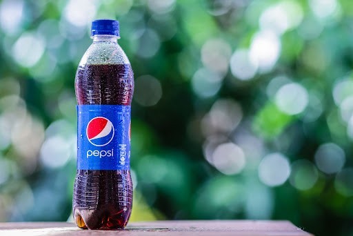
Blue in packaging is often known to correspond to the products effectiveness and reliability.
The darker the shade of blue, the more professional the product is said to be perceived. The lighter the blue, the softer and more creative the product is perceived to be. Often used in products that contribute to wellness, mental health, relaxation, and harmony.
A famous example of a brand that owns this colour is Tiffany
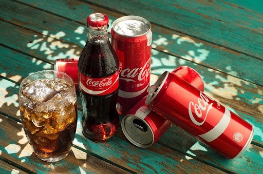
Using red in your packaging stimulates passion and can excite the potential buyer. Red signifies enthusiasm and strength so this needs to match your marketing strategy. Adding elements of gold or silver to red packaging can add value to the consumer.
A famous example of a brand that owns this colour is Coca Cola.

Known for nature, sustainability and health. Green is a great choice for eco-friendly, natural, and organic products.
Again darker green implies luxury and professional quality, while light green suggests safe and healthy.
A famous example of a brand that owns this colour is Subway.
Orange in packaging stands for fun and adventure. Orange isn’t commonly used but when it is chosen it is chosen for a product which has a reason to want to stand out.
It suggests something different, an adventure and a friendly approach. Enhancing the orange colour with another colour can ather the message and perceived value greatly.
A famous example of a brand that owns the colour orange is Fanta.
Yellow is known to be mentally stimulating when it comes to decision making.
So, yellow is a great colour to choose if your product is positioned in a saturated market. As yellow is associated with being positive and happy, it often attracts children or young adults. It can be a great colour to choose for products which bring joy.
A famous example of a brand that owns the colour yellow is Mcdonalds
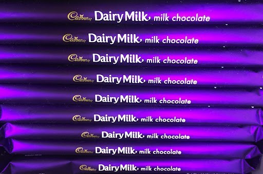
Purple has always been recognised for luxury, by using purple in your packaging you can instantly add a sense of sophistication to your product
Purple is commonly used with indulgent food brands or holistic products associated with individuality. If you want to convey luxury, purple is the colour for your brand.
A famous example of a brand that owns the colour purple is Cadburys
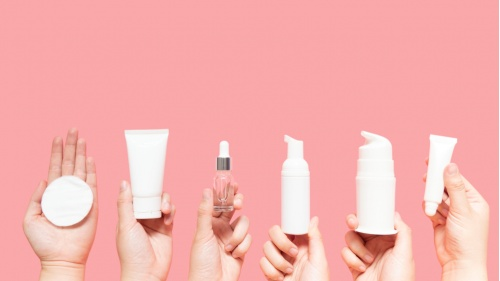
You may come across a trend in colours used within various industries. We provide custom packaging solutions for a range of industries such as food and drinks and health & beauty.
Therefore, over the 40 years, we have been trusted suppliers we have noticed a few trends which we wanted to share with you…
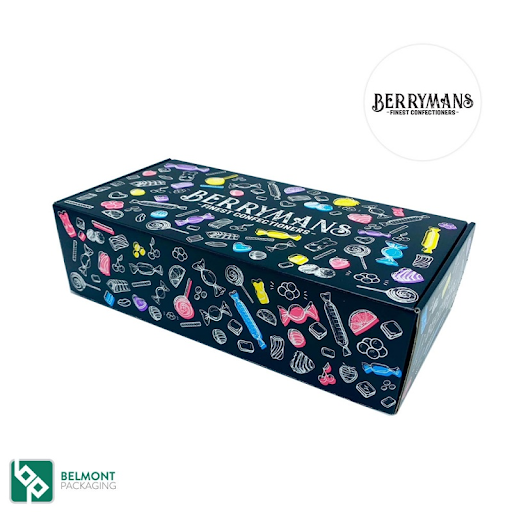
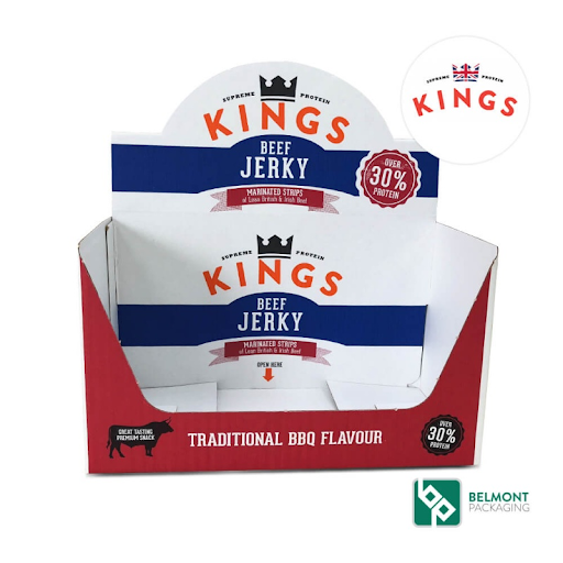
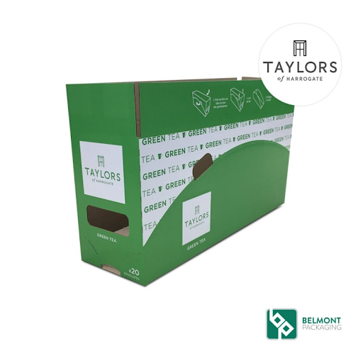
When it comes to food and drinks packaging you will often see the colours green, blue and orange but they still all stand for different things.
Green is used for natural, organic and healthy food. On the other hand, blue is used for fun foods such as cakes and sweets.

Traditionally products within the health and beauty sector use a mix of pink and blue hues.
Pink targeted female consumers and blue used for both males and females. High-end and luxury cosmetic products often associate their packaging with premium colours such as white and black.
However, more recently we have seen a trend in cosmetic packaging mirroring their ingredients within their design. For example, organic skincare products now focus on adding elements of green to
Our experienced team of designers will consider all your requirements from concept to completion.
Using our state of the art equipment and software, we can work with you to create an innovative and functional subscription box, shelf-ready, retail-ready or transit packaging solution for your product.
We provide corrugated packaging solutions for many different sectors, including but not limited to, footwear and fashion, food and drink and health and beauty.
Complete our quick enquiry form.
What are Belmont Packaging MOQ's?
Our MOQ starts from 1000 units depending on the size, style and material of the box.
How long does it take to receive a quote?
Once we have all the relevant information for your corrugated cardboard box requirements, we will aim to turnaround quotes within 24-48 hours.
However, complete bespoke designs will require longer including design time.
Check out some more FAQ's here!
